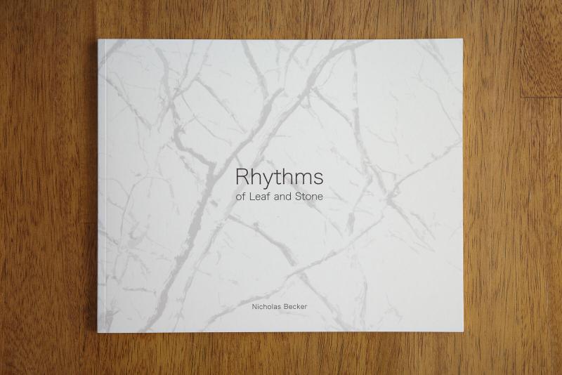
Late last year, I decided to push myself outside of my creative comfort zone by creating a photo zine. The zine’s title is Rhythms of Leaf and Stone, and it contains a brief introductory essay followed by 36 small scenes created within Missouri between the years 2018 and 2024.
I did a very limited print run of my zine through Mixam, mailing copies to several photography friends and people whose work I admire. I intended for this to be a gesture of gratitude and appreciation.
There is a very small quantity of zines remaining if you would like one, too. You can order one here if you’re interested.
Why Make a Zine?#
I created this zine not to make a profit — in fact, it was a wildly un-profitable undertaking — but rather, to learn. I wanted to know what steps were involved, how much work it would take, and whether I was capable of putting together something I was proud of.
It also provided me with the opportunity to follow through on a seed of a project idea I had had for years, although the concept morphed substantially over the course of seeing it through. The idea was to assemble some collection of images that, together, illustrated the growth and development my creative relationship with the landscapes of Missouri. This formed the backbone of the zine and gave me something to build on and refine.
Finally, I dream of building on what I learned through this experiment by putting together a “real” book some day, something with greater depth and scale. I now have a greater awareness of what such an endeavor might entail.
How to Make a Zine#
Having never made a zine before, I decided to consult an expert to help me get started, so I enrolled in a 1:1 zine workshop with Murray Livingston. Instruction took the form of conversations rather than lectures, and we talked about scoping the project, technical and design considerations, image selection and sequencing, and the pros and cons of different materials. We also spent time looking at and talking about several real-life examples. Murray provided valuable feedback at a couple decision points in the project, but it was up to me to see it through to completion.
Even though I was familiar with the notion of curating and assembling a photo project at the onset of this project, enrolling in a 1:1 workshop was the right choice for me for a couple different reasons. For one, I had never printed my work in this format before, so it was immensely helpful to have someone available to answer my questions as they arose. But more importantly (for me), it forced me to be accountable and create the time I needed to finish the zine.
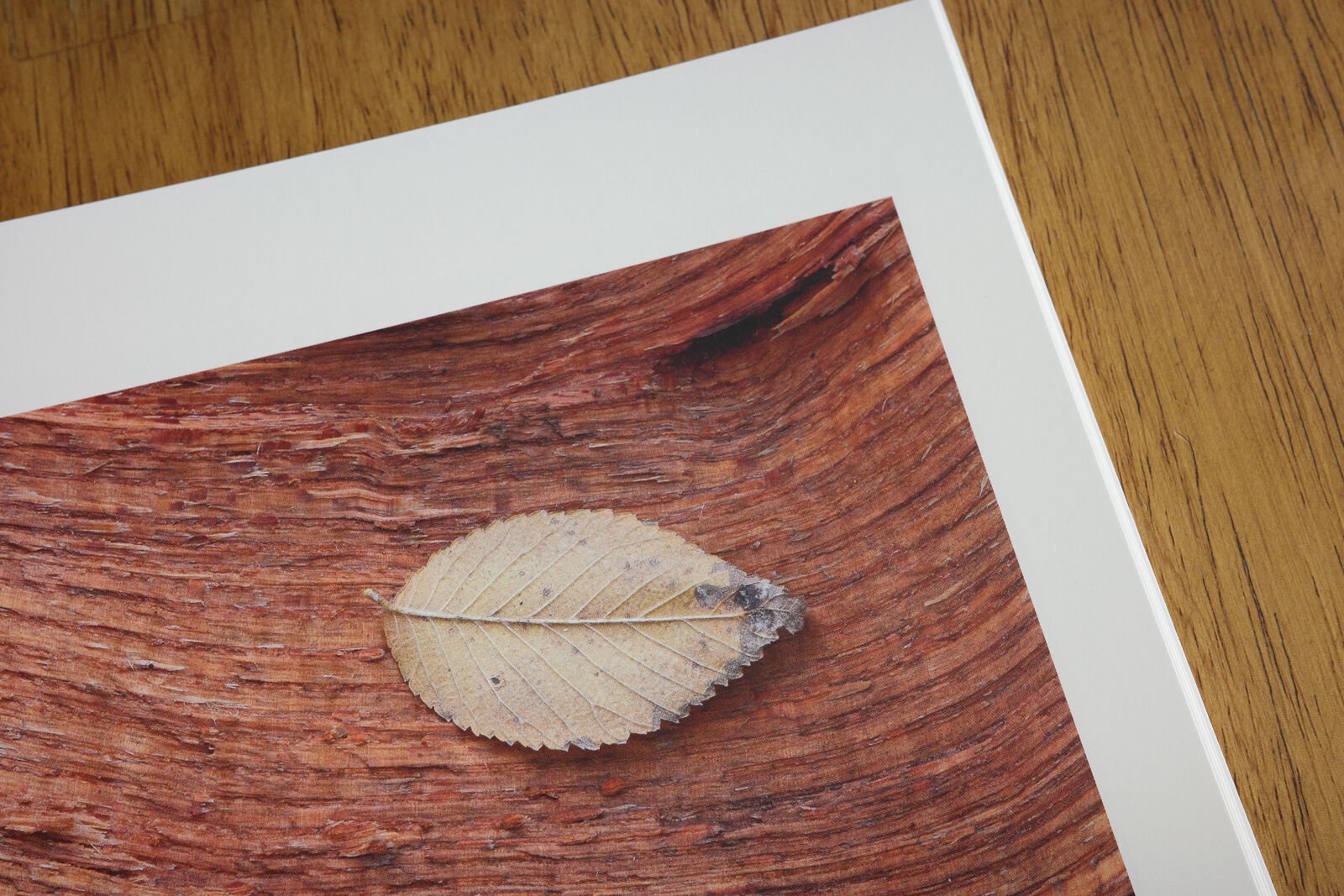
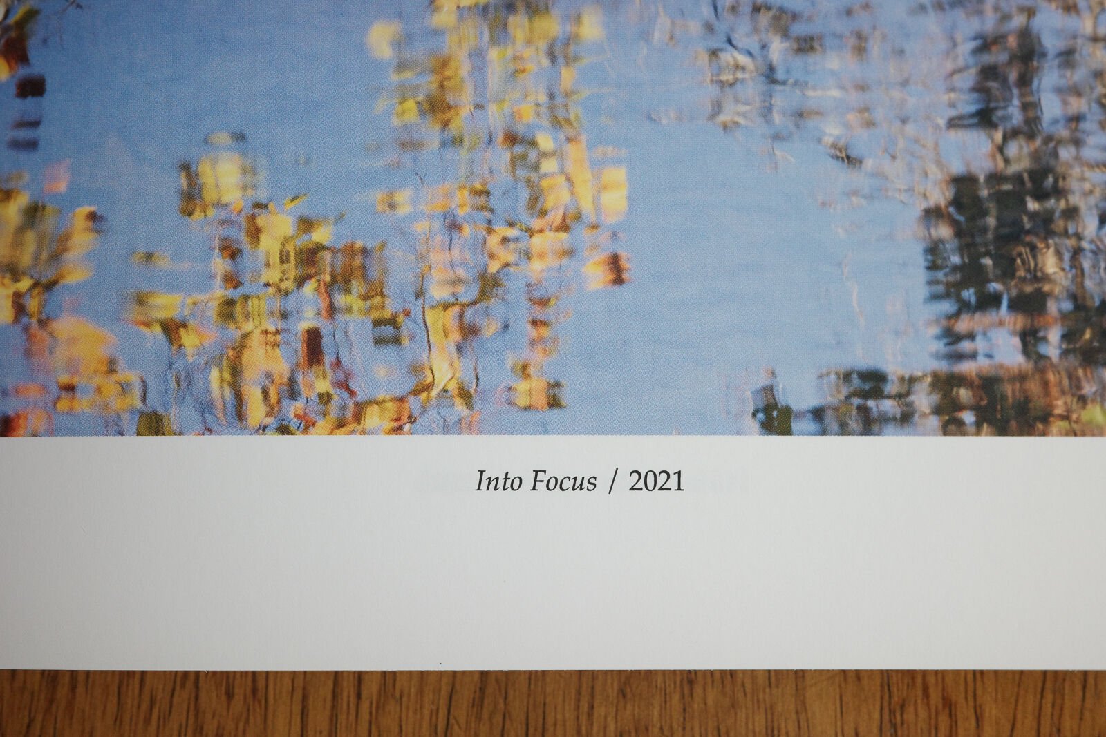
And it took a lot of time. The major stages of zine creation for me were as follows:
Define and scope the project. During this initial stage, I asked myself a number of questions about my zine: what subjects, ideas, or themes can I build on? Do I want to distribute and/or sell it? How many pages do I want it to be? What do I hope to accomplish? I decided fairly early on that I wanted to use local images and explore how my relationship with Missouri’s landscape has developed from a creative perspective. I figured 30-40 images would be a sufficient length, and I wasn’t going to worry about selling it. (See Why Make a Zine above to read about my goals.)
Select images. After I had some idea of which direction I wanted to take this project, I created a Lightroom smart collection to find my 4+ star images with the keyword missouri, then selected about 90 of what I thought were the “best” images from this pool.
Arrange and downselect. I ordered some cheap prints of these photos from Walgreens. The prints were laughably bad in terms of quality. But they were good enough to physically lay them out on my desk and start moving them around to discover patterns and relationships. Through this process, I decided that I would limit myself to horizontal color images. Not only would this create more consistency and cohesion across my project, but it also gave me a simple way to further downselect images. I continued refining and creating pairings that I thought made sense and created a narrative.
Edit images for print. This stage included CMYK conversion (more info on CMYK vs RGB) and soft proofing using ICC profiles in Photoshop. This isn’t as complicated as it sounds: you apply the profile according to the Mixam documentation, then correct any major changes to the image. In my experience, this step was straightforward, and no images required drastic adjustments.
Design and draft the zine. I used (and would recommend) Affinity Publisher for this (when I downloaded it, they provided a 6-month free trial). Mixam provides templates that will give you dimensions for your zine; use these when you first create your Publisher document. It’s important to consider edges and the no-print zones along the spine between facing pages; all of this information is provided in the template. During this stage, you can also start incorporating personalized design elements and visualizing what the final product will look like. It was during this stage that I finalized my decision to include an essay, image titles, page numbers, and an acknowledgement.
Export and upload the zine. I exported the Zine as a PDF and uploaded it to Mixam. This part took some trial and error as I dialed in the export settings and learned the quirks of Mixam’s upload platform. I ran into an early issue where a few images did not render correctly on the PDF, which ended up being a bug in Publisher. I was able to get around it by exporting with slightly different settings.
Print a proof copy. When I felt ready enough, I ordered my first proof copy to see how close the zine was to my vision.
Review and refine. I reviewed my hard copy multiple times, in different qualities of light (and in different moods). I inspected each image and took notes on tweaks I wanted to make. I also took note of the cover, the spine, and how the font looked (including page numbers). Between my initial proof copy and my final print run, I ended up reducing font size, selecting thicker paper all around (which gave me more spine to work with), and made many small tweaks to images (mainly minor adjustments to sharpening and correcting a slight magenta cast that showed up in several of the blue-hued icy images).
Repeat stages 7-8 as needed (or as long as is financially feasible). I won’t tell you how many proof copies I made before my final print run, but such is the cost of learning (right?). I do think it is critical here to allow your results to be good enough. I still wasn’t 100% happy with every single thing about my final proof copy, but I took a good look in the mirror and reminded myself that I probably never would be. I couldn’t let my perceived notion of perfection get in the way of a really nice final product that I would be proud of. It’s also important here to be realistic about your expectations: this isn’t a collection of fine-art prints on luxury paper. Remember that zine printing is a balance of quality vs. cost.
And when you’re ready… order your print run. I included a few more copies than I thought I would need (and recommend that you do the same when you get to this point).
If you’re reading this and have questions, feel free to reach out. Or better yet, hit Murray up and tell him you’re interested in another zine workshop.
My zine: Rhythms of Leaf and Stone#
Caution: spoilers ahead.
The concept of a rhythm — a repetition of some idea, phenomena, or event — is central to how my zine was conceived and executed. Images are loosely arranged by season, and this is overlaid with a rough chronological sequence, which is intended to convey the idea of creative growth over these natural seasons. Through this growth, a relationship with the landscape is developed.
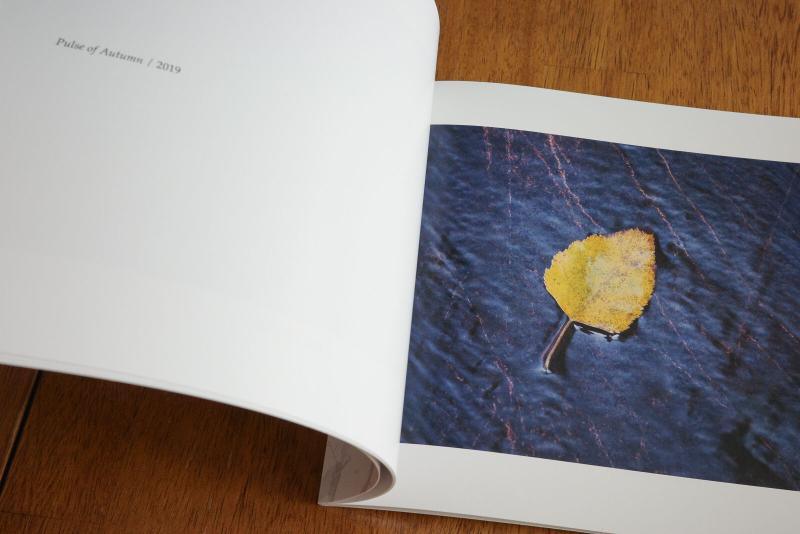
Both the opening and closing images feature canopies of trees from the ground. The former is warm, vibrant, and inviting; the latter is cold, yet bright and hopeful with a clear blue sky. The cover image is also derived from the book’s final image, reinforcing the idea of a cycle.
Images are arranged in complementary pairings, with consideration to subject, composition, and color. There are four images that stand without a paired image, to provide some space between a larger grouping of images and to direct more attention to the individual image. As the images progress, oscillating from eye-level perspectives to the ground and back up again, these pauses are meant to be analogous to taking a break for a quiet moment during a hike.
In Conclusion: Just Go For It#
Rhythms of Leaf and Stone isn’t the most eye-catching collection of images ever put together, but it was a huge success in that I accomplished what I set out to do: challenge myself, and learn something new along the way. I was satisfied with the outcome here, but even if I wasn’t, I still would have walked away with the knowledge I needed to do it better the next time.
So if you’re considering a project like this, or any other project involving physical prints of your work, I strongly encourage you to take the leap and give it a try.